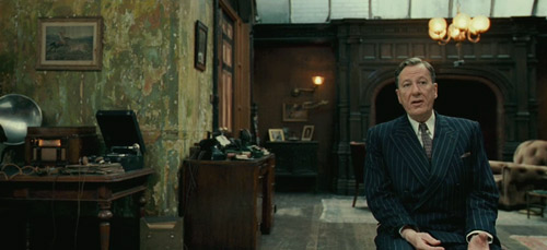
The former is one of those rare movies that my boyfriend and I both love. Although he's getting his PhD in economics, he minored in Linguistics in college (and had a lisp when he was little) so I didn't have a very hard time dragging him to watch a movie about a speech therapist - which he ended up dubbing a "period bromance".

all images, The Weinstein Company
Since the latter movie I mentioned, Jane Eyre, hasn't actually come out yet, I suppose I should in all fairness withhold judgment. However, having spent a few days last fall watching disappointing film adaptations of Jane Eyre, a book that topped my list of favorite books for most of my growing-up, I have to say that I have high hopes. The 1983 BBC version is thought by many to be the best. It's not bad, but Zelah Clarke really doesn't do it for me as Jane, and despite Timothy Dalton's fabulous Rochester, low production values really spoil the experience. On the other hand, it certainly beats Masterpiece Theatre's 2006 version, which dumbs down the script and sexualizes the whole thing so much it made me feel embarrassed on behalf of the "modern viewer" that the filmmakers were so inelegantly trying to attract. I found myself fervently wishing that someone would see the need for an adaptation that actually captures Brontë's vision – not Hollywood-izing it but not making it look like it was shot by film students, either. And then I went to see the King's Speech and saw this preview:
Great actors who are just funny-looking enough to make it work? check. Adherence to original text? check. Beautiful production design and historical accuracy? check. Visually striking romantic period piece based on classic literature with a strong female lead? check.


Great looking Jane Eyre trailer- but WHY IS SHE PRETTY?? Is it seriously impossible to tolerate casting a lead actress that doesn't have perfect features? Half the point of Jane Eyre is that she's nothing to look at and is awesome anyway. urgh.
ReplyDeleteI really don't think she's all that pretty - Jane's supposed to be plain and little and I think without her amazing hair Mia Wasikowskais pretty plain, and she's definitely little. I mean, Jane being shy and not particularly pretty was what made me love the book in the first place, and that's why I didn't even try watching Zeffirelli's version - the actors were way too good-looking for it not to be ridiculous. I think they could've done much worse with this one...
ReplyDelete