Admittedly, only some of it is truly innovative. Most museums have their collections online, where you can often zoom into them in comparable detail; the way that Google Art Project is consolidating pieces of these collections on one website is really just a glorified and limited ArtStor for the public.
The "gigapixel artworks," however, are an interesting addition to public resources for art education. I read one article expressing outright disdain for the museums' choice of which artworks to choose for this "gigapixel" close-up. I can't really disagree more with the author's opinion that the "selection is perverse." Most museums very rightly chose pieces that would benefit from this sort of viewing - in other words, instances where the technology adds something to the viewer's experience of the piece because of the physical texture of the painted surface.* The ability to actually explore a museum just as they could previously explore a city with Google Street View is of course lots of fun - but the low-quality images and the difficulty of moving around are some reasons that this will give us much cause to worry that museums are going to have a hard time getting people in their physical doors. It's a fun and tantalizing taste, but not enough to really fill you up.
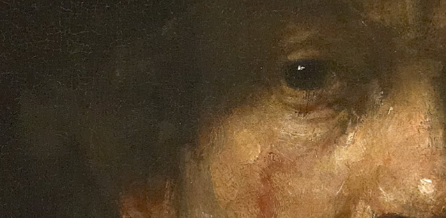
It certainly isn't helping me get over New York, though, when I can "walk" through some of my favorite rooms in the Met...

 |
| detail, Rembrandt Harmensz. van Rijn, Self-Portrait. 1658. The Frick Collection, New York. |
Even better is having the chance to examine some that I won't be able to visit in person for a long time.
 |
| detail, Pieter Bruegel the Elder, The Dutch Proverbs. 1559. Gemäldegalerie, Berlin. |
 |
| detail, Caspar David Friedrich, Der Mönch am Meer (Monk by the Sea). 1808-1810. Alte Nationalgalerie, Berlin. |
 |
| detail, Jan Van Eyck, The Madonna in the Church. ca. 1438. Gemäldegalerie, Berlin. |
* this quote from the Telegraph article particularly galls me: "The Museo Reina Sofia in Madrid opts for a Cubist composition by Juan Gris instead of Picasso’s Guernica, which, for many people, is the only reason they actually visit the museum in the first place". I'm sorry, should museums be encouraging people to come to a museum only to see that piece they heard was really famous? Should we not be trying to educate visitors about the non-"highlights" - the works that they don't already know - and demonstrate the reasons why those works are equally worthy of their attention? And, beyond that, is it not clear that the Reina Sofia chose the Gris because it's a multimedia collage whose small details of texture are only visible at that level of zoom?

No comments:
Post a Comment