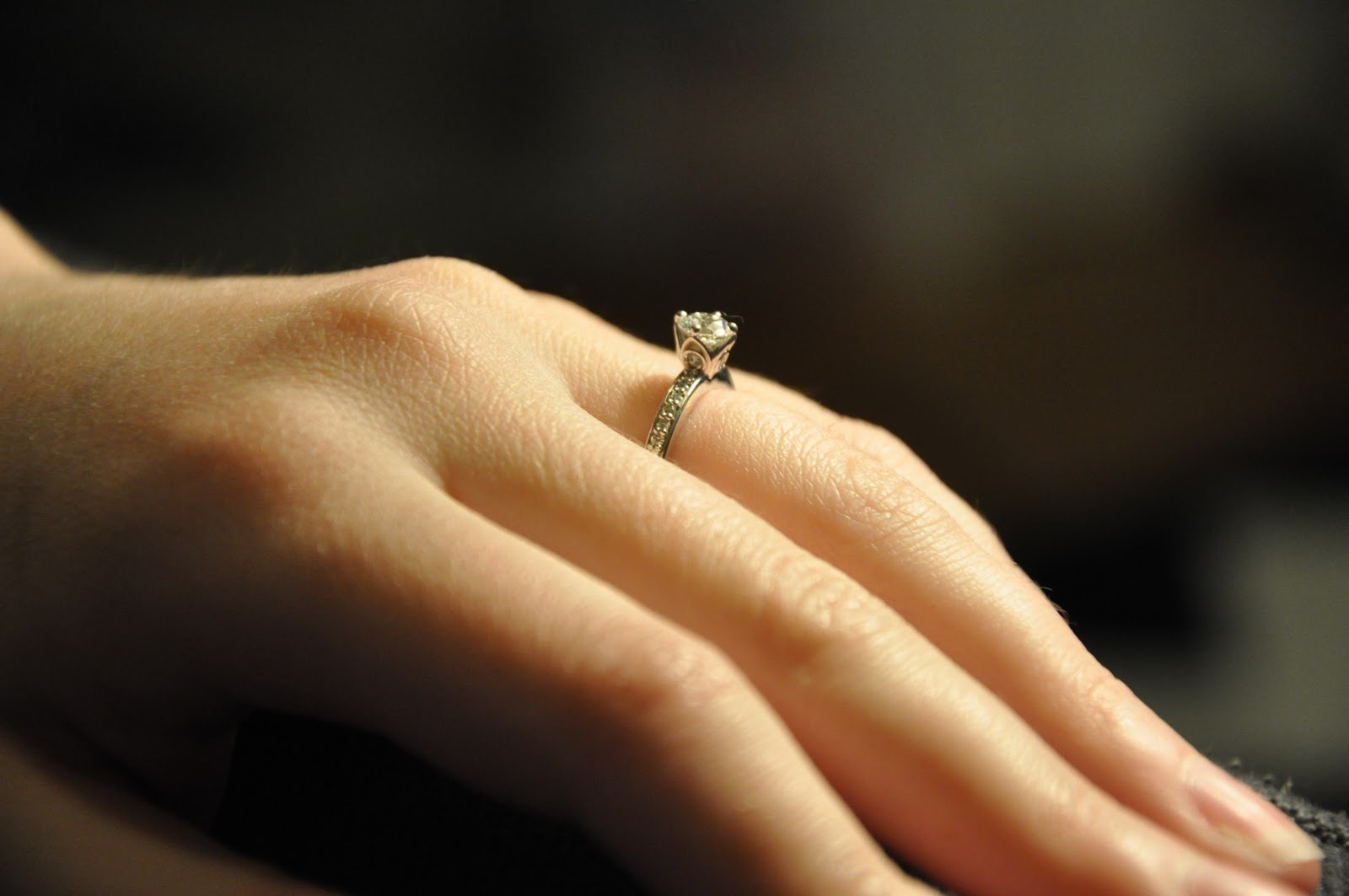
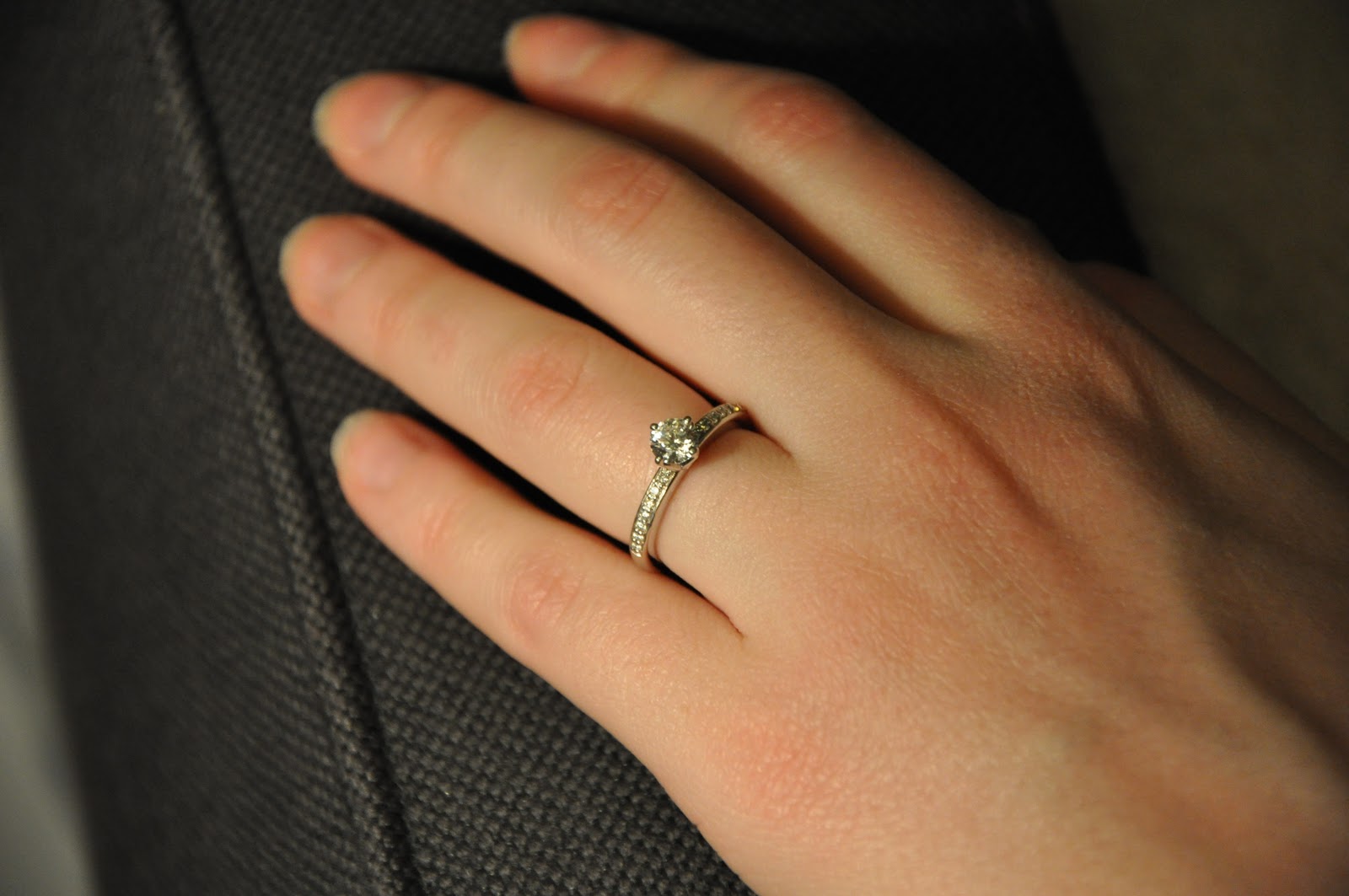
Thursday, March 31, 2011

IT BEGINS

As I'm sure you can all guess, my second-favorite activity for the past few weeks has been reading wedding blogs (the first is catching my now-fiancée grinning at my ring while I'm not looking). Despite the fact that we've been basically-engaged for years, I've had a strict no-thinking-about-weddings policy. So it comes as no surprise that I wasted no time jumping headfirst into all the wedding blogs and magazines I've seen referenced on my favorite blogs but always forced myself to ignore.

After a few weeks of this, I'm totally paralyzed with over-inspiration and a (probably self-destructive) desire to make our wedding
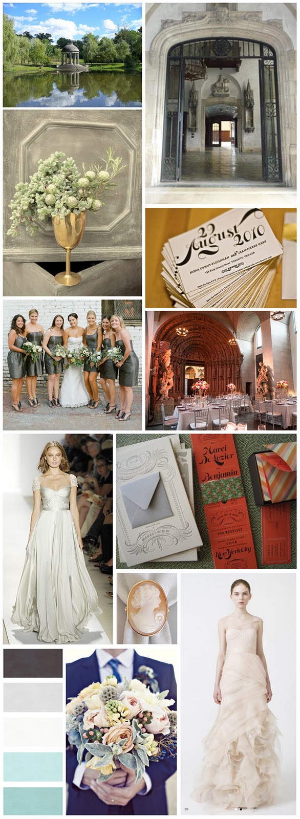
perfect and unique. I don't know why my first response wasn't to just start blogging all my favorite images (the original purpose of this blog was, after all, to write out my ideas and obsessions and thereby - ideally - gain some perspective and clarity). But better late than never, right? So I think I'll start posting weekly favorite wedding inspiration boards. For the time being, these are NOT going to be curated collections of images; they won't have color or style themes, and won't represent inspiration for any single wedding. Like this one, they'll just be things that have particularly caught my attention but don't necessarily go together. Maybe - fingers crossed - this will help me choose favorites and make decisions, and eventually these will turn into mood boards for our real wedding.

clockwise from upper right:
Temple of Love at Larz Anderson Park in Brookline, MA (an actual ceremony venue option!)
a private estate in Newport, MA
save-the-dates via Oh So Beautiful Paper
Adolphus Busch Hall, Harvard (an actual reception venue option!)
invitations via The Indigo Bunting
cameo ring - ?
Vera Wang gown
bouquet - ?
color scheme - ?
Reem Acra gown (my current favorite, I think...)
bridesmaids via Martha Stewart Weddings
succulent arrangement - ?

Tuesday, March 22, 2011

LIFE

has been a bit of a whirlwind lately. In a good way:


In related news, this will be turning into a wedding blog in 3...2...1...

Tuesday, March 1, 2011

ROCK STARS: AGATE & GEODE ROUNDUP

Agate, malachite and other minerals have been used to create beautiful decorative objects for thousands of years. Agate is actually the most popular gemstone used to carve cameos (look for a cameo roundup on the blog sometime soon!). Prized for its durability, it was often carved into thin pieces and combined with gold or other precious metals to create delicate but sturdy repositories for valued objects. 

left to right, all from the collections of the Metropolitan Museum of Art:
Box for rouge and patches. English, ca. 1760. (38.50.6 a-c)
Watch, Charles Bobinet (ca 1610-1678). Swiss, mid-17th century. (17.190.1617)
Cup, standing with cover. French, mid-17th century, finial 19th or early 20th. (32.100.241a, b)
Banded agate amphoriskos (perfume bottle). Early Imperial Roman, late 1st century B.C. – early 1st century A.D. (2001.253)

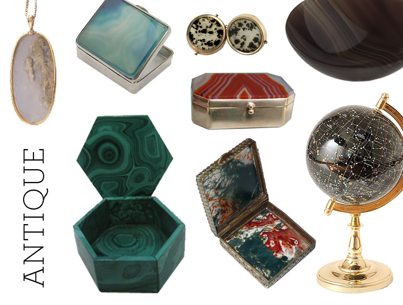
Many modern takes on this trend emphasize its glamorous aspects – sparkly geodes, large-scale patterns, bright colors – but these antiques and antique-inspired pieces highlight the elegant simplicity of these natural materials:

clockwise from upper left:
Victorian agate 10k gold pendant, $195 at Ruby Lane
Antique deep blue agate and silver box, $85 at Ruby Lane
Victorian agate cufflinks, $100 on Ebay
Late 19th century banded agate snuff box, $125 at Ruby Lane
Tigela agate bowl, $55 at Rablabs
Agate celestial globe, $149.99 on Ebay
Victorian moss agate box with filigree setting, $105 on Ruby Lane
Small malachite box, $35 at Wild Iris Market

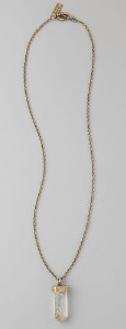
It's no secret that this blog is a year or so late to the game in talking about this particular trend. It's certainly not that I didn't notice it as it began. It's just that, honestly, I didn't much like it. Plenty of blogs wrote about rock crystal lamps and geode bookends. I'm not a fan of the former, and the latter took a while to grow on me. What actually peaked my interest was this necklace that I bought on clearance this winter at Madewell, a delicate, unpolished-but-elegant raw crystal pendant that also happens to go with everything.


Exploring this raw mineral idea a little further, I started to get past my former dislike and was intrigued by the contrast between raw, jagged forms and sparkly, polished and glam finishes. I found some other pendants that caught my eye...

clockwise from right:
Surrounded single roped earthy geode necklace, $145 by Brook&Lyn
Jefferson necklace, $84 by Stone & Honey
Marbled stone pendant necklace, $9.80 at Forever21
Karli necklace, $215 by Jasmine Pannamma

...and then promptly started exploring what other agate and geode pieces the internet had to offer. My interest was already peaked by this point, but a trip to the Harvard Museum of Natural History and its fantastic mineralogical and geological gallery clinched my decision to make this roundup!


clockwise from upper right:
Platinum drusy stud earrings, $200 at Pade Vavra
24k gold-encased plum and blue geode earrings, $86 by irisjewelrydesign on Etsy
Custom geode cufflinks in sterling silver, $160 by elseetee2 on Etsy
Mexican agate ring, $428 at Free People
Tourmaline slice shower earrings, $2910 by Jacquie Aiche
Kimberley McDonald 18k white gold geode and diamond earrings, £7885 at Browns
Agate geode and diamond ring, $2450 at Vivre
Lady Grey geode earrings, $176 at Dear Fieldbinder

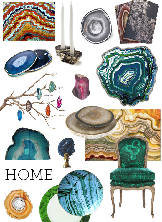
Geode bookends have certainly been one of the most popular manifestations of the trend, but that isn't the only option you have to bring a little bit of this into your home. I'm particularly in love with the lamp finial, the malachite plates, the amazing rug, and the one-of-a-kind malachite-patterned chair. If you want your own version, the (to the trade) fabric is "gemstone" by Tony Duquette for Jim Thompson fabrics.

clockwise from upper left:
"Geode" rug (detail), £80 by Mother of Pearl Atelier
Agate candle holders, $110 at A+R Store
Sliced agate mini frame, $50 at Plantation
Agate 3-ring binder, $20.10 at Zazzle
Nature exploration agate notebook by Oh Joy!, was $13.50 (sold out)
Etage rug by Studio Bijoux via Design Milk
Agate cheese plates, $60 & $75 at Jayson Home and Garden
Crazy Lace agate fantasy poster, $22.70 at Zazzle
Tony Duquette / Belvedere "Malachite" chair at 1st Dibs
Malachite plates by D.L. & Co. via The Peak of Chic
Malachite pattern by Gibson Designs, $16.99 / 5-piece setting at Replacements, Ltd.
Agate clock, $85 at Vivre
Cobalt blue geode lamp finial, $8.75 at Lamp Finials
Aqua agate bookends, $17.50 on Ebay
Joia agate ornaments, $44/6 at Rablabs
Pink bookends, from $18.95/pair at Phoenix Orion
Brazilian blue agate plate/coaster, $25 at Rain Collection

Leave it to Alexander McQueen to be one of the first fashion designers to make a dress printed with the patterns found in natural minerals. The idea is certainly a little slower to catch on in fashion than in jewelry design or home décor, but if Matthew Williamson's brand new gown is any indication, we very well may be seeing more of it in the future. It doesn't look like this trend is going anywhere soon!

clockwise from upper left:
Agate scarf by Richard Weston Studio for Liberty, image via here
Agate bag, screen-printed by anorthwind on Flickr (check out the lining, too!)
Alexander McQueen agate print chiffon scarf, Saks (sold out)
Richard Sorger dress, S/S 2009
Alexander McQueen agate print dress via Polyvore
Geode dress by Carrie Hayes, S/S 10, via The Fashion Gazer
Matthew Williamson agate chiffon gown via Polyvore

Thursday, February 24, 2011

IN WHICH I RETURN, BEARING GIFTS

Namely, lots of cheap fabric. I kind of gave up on the blog there for a while, but I promise that I'm back in full force from now on. I have a new job that will keep me a little busier than I was before, but I'm slowly working on some updates around the apartment and I have a huge list of partially finished future posts. 

I found myself on fabricguru.com last week, a site that I've browsed in the past. It's not the most organized or well-designed site, but there are a lot of hidden (cheap!) gems if, like me, you have some patience procrastination skills. Many of their fabrics are particularly inexpensive because they're sold as pre-cut pieces. This time I found lots of fantastic fabrics, many of which I hadn't seen before. Here are my favorites, some of which are under $5/yd!


by rows, top to bottom:
Robert Allen Cat's Cradle, $4.95/yd
P. Kaufmann drapery fabric, $8.98 for 1.2 yds
Kravet Greek Maze, $36.98 for 5.2 yds
Kravet tapestry fabric, $17.98 for 2.1 yds
Mill Creek Greek Key drapery fabric, $23.98 for 4 yds
Bonzai Damask upholstery fabric, $14.99 for 3.2 yds
Duralee upholstery fabric, $17.98 for 1.8 yds
Cabo upholstery fabric, $40.98 for 5.8 yds
Richloom Chainlink, $22.95/yd
Wyatt Damask upholstery fabric, $23.95/yd
Thibaut Courtyard, $31.98 for 1.6 yds
Barrow Yuma, $28.95/yd


by rows, top to bottom:
Richloom Emily in charcoal, $21.95/yd
Richloom Emily in grapevine, $21.95/yd
Richloom Lucy in eden, $11.95/yd
Richloom Lucy in chocolate, $4.98 for 1 yd
Richloom Mirth in lark, $!5.95/yd
Richloom Mirth in bouquet, $15.95/yd
Richloom Campione, $5.95/yd
Richloom Mirth in licorice, $15.95/yd
P. Kaufmann Jacobean, $13.98 for 2 yds
Richloom Invigorate, $4.95/yd
Richloom Katherine, $21.95/yd
Robert Allen Scenic Flora, $16.95/yd

I can picture that last one working as a poor man's version of the most amazing bench in existence:


by rows, top to bottom:
Richloom Modesto, $79.98 for 20 yds
Robert Allen Khanjali in glacier, $15.95/yd
Robert Allen Khandar in cinnabar, $12.95/yd
Robert Allen Khandar in indigo, $12.95/yd
Robert Allen Khanjali in peacock, $15.95/yd
Robert Allen Khandar in jewel, $12.95/yd
Ikat tapestry fabric, $182.98 for 18.2 yds
Richloom Cornwall Suzani in garden, $17.95/yd
Richloom Calder Suzani in linen, $85.98 for 14.1 yds
Richloom Calder Suzani in licorice, $17.95/yd


by rows, top to bottom:
Richloom Giraffe, $23.95/yd
Richloom Ridges, $24.98 for 6.2 yds
Robert Allen Timberland, $29.98 for 3 yds
Mill Creek drapery fabric, $11.99 for 4 yds
Osborne & Little Theorem, $26.98 for 1.8 yds
Kravet Fretwork, $39.98 for 5 yds 

There's been some talk around the blogosphere lately about what is passé, whether we should care, and whether that sort of judgment can really be valid when 99.9% of the world has never seen/heard of said motif/pattern/style/concept. As far as I know, my audience on this blog thus far consists of my lovely, loyal friends who are not weird design obsessives like me. So most of you have probably never heard of Kelly Wearstler's Imperial Trellis, and therefore don't know that it's been declared over by all the cool design people.

Imperial Trellis Schumacher Fabric

I still like it, okay? So I was a little excited when I came across this in my fabricguru.com travels:

Richloom Platinum Collection Cleopatra Chenille Upholstery Fabric in Chocolate $17.95 per yard
Richloom Cleopatra, $17.95/yd

– a
lbeit a little disappointed that they seem to only carry it in poop color. A few minutes of googling later, behold – pretty colors! It certainly can't be used to the same effect as the real thing (it seems to be much smaller-scale and it's chenille) but I think the aqua & green colorway could look absolutely adorable on a cute chair!

here, here, and here

D
o you love any of these fabrics as much as I do? What would you use them for? 

Thursday, February 17, 2011

FAMILY PHOTOS

I do realize that I fail miserably at regularly posting, the #1 item on all how to have a successful blog lists. Consider this my plea for forgiveness regarding my recent disappearance. I drove to Central New York this past weekend to visit my parents and came home with a box of many hundreds of family photos to scan and organize. This is a taste of what's been keeping me busy during all my waking hours (that aren't spent at my real job) over the past few days:

my grandmother and her sisters

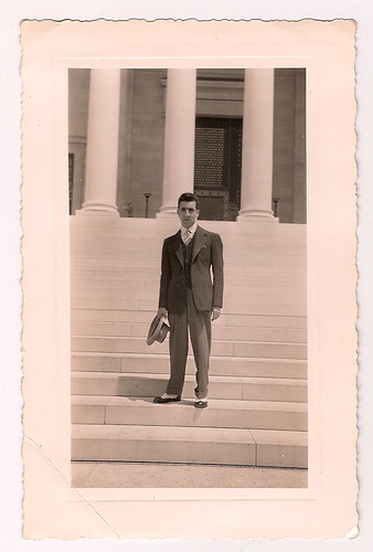
my grandfather looking dapper in spectator shoes

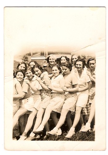
my grandmother with her friends

my grandmother at the beach with friends

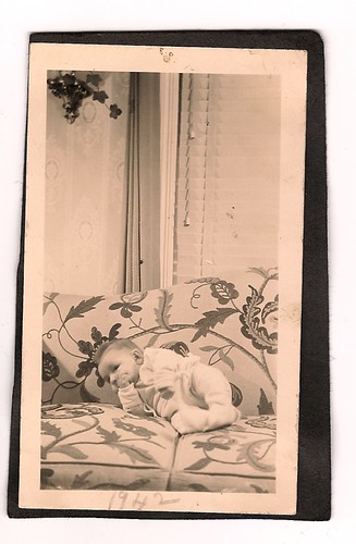
my uncle as a baby (on an absolutely fabulous couch!), 1942

my mother in May 1948, 5 years old

my mother and my uncle, summer 1949

my mother as a bridesmaid in a friend's wedding, August 1967

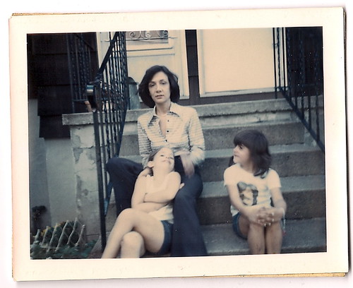
my mother, my sister and her friend, early 70s (I love that blouse and those huge wide-leg pants!)

More design-related posts soon. Or maybe I'll just keep posting photos of all the fabulous things my relatives wore before I was born...

Thursday, February 10, 2011

PATTERNS AND TEXTURES

I'm in the process of helping some friends with their apartment, and it's finally starting to come together after many months. Though it's far from done, we've now purchased almost everything and I'm starting to see how the colors and textures will look side-by-side. There are still some decisions to be made, but here are some mockups of the fabrics, paint colors and accessories that each room might contain:

DINING ROOM


BEDROOM


LIVING ROOM


Since the budget is super limited, each space is being decorated around the few things they already had and whatever we could scrounge for free. More pictures to come!

Thursday, February 3, 2011

GOOGLE ART PROJECT

I know this is probably old news by now, but a couple of days ago Google released Art Project, which allows you to explore seventeen museums around the world and zoom in to specific paintings in incredible detail.

Admittedly, only some of it is truly innovative. Most museums have their collections online, where you can often zoom into them in comparable detail; the way that Google Art Project is consolidating pieces of these collections on one website is really just a glorified and limited ArtStor for the public. 


The "gigapixel artworks," however, are an interesting addition to public resources for art education. I read one article expressing outright disdain for the museums' choice of which artworks to choose for this "gigapixel" close-up. I can't really disagree more with the author's opinion that the "selection is perverse." Most museums very rightly chose pieces that would benefit from this sort of viewing - in other words, instances where the technology adds something to the viewer's experience of the piece because of the physical texture of the painted surface.* The ability to actually explore a museum just as they could previously explore a city with Google Street View is of course lots of fun - but the low-quality images and the difficulty of moving around are some reasons that this will give us much cause to worry that museums are going to have a hard time getting people in their physical doors. It's a fun and tantalizing taste, but not enough to really fill you up.


It certainly isn't helping me get over New York, though, when I can "walk" through some of my favorite rooms in the Met...


and visit an old favorite at the Frick in stunning detail.

detail, Rembrandt Harmensz. van Rijn, Self-Portrait. 1658. The Frick Collection, New York.

Even better is having the chance to examine some that I won't be able to visit in person for a long time.


detail, Pieter Bruegel the Elder, The Dutch Proverbs. 1559. Gemäldegalerie, Berlin.

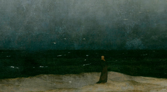
detail, Caspar David Friedrich, Der Mönch am Meer (Monk by the Sea). 1808-1810. Alte Nationalgalerie, Berlin.

detail, Jan Van Eyck, The Madonna in the Church. ca. 1438. Gemäldegalerie, Berlin.

* this quote from the Telegraph article particularly galls me: "The Museo Reina Sofia in Madrid opts for a Cubist composition by Juan Gris instead of Picasso’s Guernica, which, for many people, is the only reason they actually visit the museum in the first place". I'm sorry, should museums be encouraging people to come to a museum only to see that piece they heard was really famous? Should we not be trying to educate visitors about the non-"highlights" - the works that they don't already know - and demonstrate the reasons why those works are equally worthy of their attention? And, beyond that, is it not clear that the Reina Sofia chose the Gris because it's a multimedia collage whose small details of texture are only visible at that level of zoom?

NEW-TO-ME FABRIC

I found this fabric the other day and I am in love. I've been looking for the perfect print to recover the currently very boring white chair in my living room...


What do you think? A good option? 

If that colorway doesn't do it for you, here are the others:


Wednesday, February 2, 2011

INSPIRATION: BEDROOM

I think the inspiration for my bedroom is much more evident in the final product than was the case for my living room. It started with two ideas: first, that I definitely wanted dark walls, and second, that I happened to find an awesome asian screen for $25 on craigslist. With those elements fixed, I decided on a neutral but luxe palette to complement the wow factor of the screen-headboard.


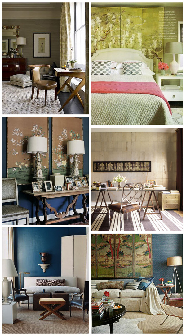
numbers determined by rows, top to bottom
[2], a bedroom by Betsy Burnham, is one of my all-time favorite bedrooms.
[1] Stephen Gambrel and [4] Nate Berkus: these type of neutral, textured and luxurious spaces were what I had in mind for the furnishings.
[3] also Betsy Burnham. This is one of the closest to how my bedroom actually turned out - although, in this picture, the white molding looks good, whereas it's starting to drive me crazy in my room.
[5] I loved the peacock wall color in this Domino image. My almost-identical version is Behr's "Heron."
[6] Although the furnishings in this room by Peter Frank (with the exception of the light cowhide) are a little too casual-boho for my taste, I love the vintage screen against that deep blue grasscloth! 


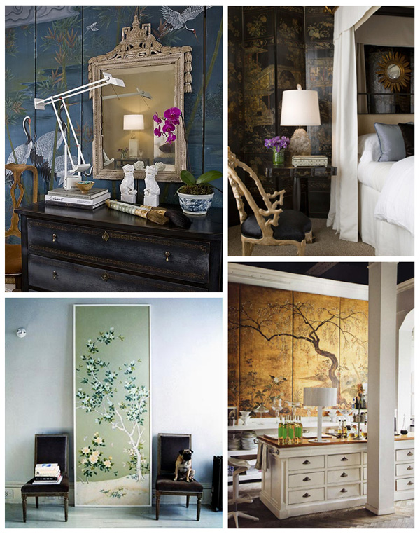
I doubt anyone needs convincing to agree that a giant gold chinese screen is pretty fantastic, but here's some corroboration, just in case:


[1] I love the eclectic mix of styles and colors in this space by Huntley and Company.
[2] A little darker and more overtly glamorous, this bedroom by Cecilie Starin is nevertheless similar in its use of neutral colors and a variety of textures to create that modern-chinoiserie vibe.
[3] An old Domino favorite, this little vignette isn't really a screen, but is still my favorite inspiration for large-scale chinoiserie pattern.
[4] This image of Lázaro Rosa Violán's studio has also made the blog rounds time and time again, but it's my favorite example of a chinese screen mounted on a wall.


Dark bedrooms have been in everyone's mind for a while now, and I've stocked up plenty of dark-walled spaces in my files. These are some favorites:

[1] This was one of the first images I saw that made me really interested in interior design. I don't know what specifically clicked, but it might have been the combination of dark walls (I grew up with white ones), the chandelier, and those luscious pooled curtains.
[2] The Portrait Suites Hotel, via Apartment Therapy
[3] Just like everyone else, I am still completely obsessed with Jenna Lyons' house.
[4] Homes and Gardens magazine


And my favorite subset of dark walls: dark blue walls. Just in case there weren't enough examples earlier in this post, here are a few more:


[1] Another early favorite. Someday I'll have a room with this color scheme!
[2] If I could somehow combine my wall color and my headboard, it would equal this wallpaper from House and Garden magazine. I would also kill for those "clostra" window screens.
[3] Drake Design Associates. I kind of wish my nightstands were the left half of this desk.
[4] Dwell Studio 

I hope that satisfies everyone's thirst for pretty pictures for the week! Now this blog is going to return to regularly scheduled programming. Oh wait, that's just more pretty pictures...
Monday, January 31, 2011

INSPIRATION: LIVING ROOM

As promised, I've collected some of the images that inspired me most while putting together my apartment. If anyone reading also reads other design blogs you've probably seen a lot of these already.* Although this is our second apartment, it's the first where we really had the resources to do what I wanted, so there are a lot of oldies-but-goodies that have been stuck in my head for a couple years!

First, images that inspired the overall feeling of the living room, with some explanation below:


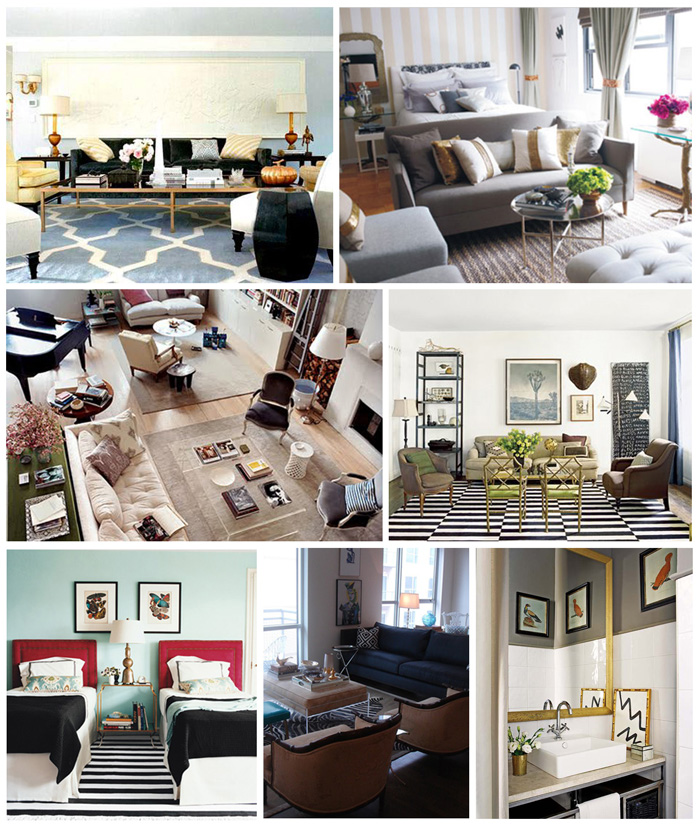
by rows, starting in upper left:
[1] A simple, uncluttered living room in neutrals with a fantastic rug by Kelly Wearstler.
[2] Nate Berkus' design for his sister's apartment. This is one of my all-time favorites (mmm, grey and gold) and a fantastic use of a small space!
[3] Deborah Needleman's apartment, another longtime favorite - actually, one of the first rooms I fell in love with after buying my first decorating purchase: the Domino book! I love the pops of color anchored by light neutrals, the way the room is divided into several areas, and the french chairs with that clean-lined sofa and coffee table. 
[4] Oh, Nate. His own living room, with a fantastic b&w rug and a big piece of typographic art...
[5] Another Domino favorite. Even though it's a bedroom, I was inspired by the lamp with its interesting silhouette, b&w rug, and the use of robin's egg blue mixed in with that bold black and white (more on that color later).
[6] From a house tour on La Dolce Vita that (I thought) had a perfect mix of girly glamour and mid-century lines.
[7] I know it's a bathroom, but I love that grey and white palette with gold and black accents. Estefanía Carrera and Alejandro Fauquié, also via La Dolce Vita.


I knew I wanted Panton S chairs, even though I already had an antique dining table, and I found plenty of backup for the combination:


[1] here via Luphia Loves and [2]: Panton S chairs with antique tables
[3] Tia Zoldan and [4] Jen Altman: I love the contrast of those solid legs in natural wood with sleek, light colored chairs


I love color, but I tend to be afraid of actually using it. I'm working on it! But in the meantime, I promised myself I wouldn't make my living room entirely neutral, and one color I unabashedly love is robin's egg blue. My love for it started, again, with the Domino book and some other blogosphere classics:


[1] Domino
[2] Domino
[3] Miles Redd
[4] Domino


Although those images are all a few years old, the color certainly hasn't gone out of favor. Pantone's color of 2010, anyone? I've been loving darker peacock and brighter turquoise shades like these:


[1] Jonathan Adler
[2] Who says bathrooms can't inspire living rooms? I love this design board by Kyle of Knight Moves.
[3] Brian Watford
[4] ? 

One of my biggest design pet peeves is the superfluity of bookshelves that have hardly any books on them. We have a lot of books. Our old apartment had seven Ikea Billy bookshelves, and they were all full. If you look closely at the images of our current bookshelves, you might notice that all the shelves actually have two rows of books on them. These bookshelves were inspiration not only because they look like they belong to people who actually read, but three of them are not built-in!


[1] ?. See, putting the sofa in front of the bookshelves isn't completely crazy...
[2] Domino, one of my favorite libraries.
[3] ?. Design magazines don't like bookshelves that don't go up to the ceiling. I mean, I understand why - but for those of us who have high ceilings, I like this look.
[4] via I Suwanee


I know that painted campaign furniture, antique chests, pagodas and sunburst mirrors aren't exactly groundbreaking anymore, but these elements stuck in my mind long before I actually found them for myself.


[1] Jenny from Little Green Notebook's painted campaign wall units – mine are the largest thing I've ever painted and I'm lucky I could just follow her instructions word for word!
[2] ?
[3] Lonny
[4] Melanie Turner

phew. And that's enough pretty pictures for the day. Bedroom inspiration tomorrow!

*N
ot to mention a lot of zigzag rugs, foo dogs, turquoise, bus scrolls, and prominently displayed bar trays. I never claimed to be original...